
App Style Guide
The design system built for The REFUGE app experience — colors, type, components, and photography direction, established through the founding-member landing page and welcome pages, the first real pieces of it built so far. This documents the product’s own design system, not a prescription for the brand overall; The REFUGE’s full marketing identity is Ella and Kennedy’s to shape.
A warm paper palette, not a bright one.
Every surface on this page reads as paper, wood, and early light — never stark white, never saturated. The palette is intentionally low-contrast and quiet; forest and gold carry almost all of the emphasis.
One serif for feeling, one sans for function.
Cormorant Garamond (italic, almost always) carries every headline and moment of warmth. Jost handles everything structural — labels, buttons, footers, and body copy at small sizes. They never trade places.
The circular wordmark, in two weights.
The same mark works on both light and dark grounds — use the dark ink version on paper backgrounds, and the white version only over a photo or a dark panel.
- Always keep clearspace around the mark roughly equal to the height of the “REFUGE” wordmark inside it — don’t let text or edges crowd it.
- Never recolor the mark, add a drop shadow beyond the site’s existing subtle one, or place it on a busy/high-contrast photo without a scrim behind it.
- Minimum display size: 60px tall. Below that the inner wordmark stops being legible.
The recurring pieces.
These show up, in this exact form, on every page — the landing page, both welcome pages, and the Kit email template.
$75/month
Rounded corners, a soft shadow, a thin border — this is the shape every price/perks card and every welcome-page perks list uses.
Here at The REFUGE, we believe the practice is only half of the medicine.
There’s nothing else you need to do.
A deep forest-to-gold gradient panel, reserved for a genuinely special moment — the Leading Edge program, next-step confirmations. Not used for routine content.
Real places, warm light, never staged.
Every photo on the site is a real, unposed moment — golden hour meadows, misty forest paths, quiet coastlines. No stock-photo gloss, no studio lighting, no smiling-at-camera stock imagery.
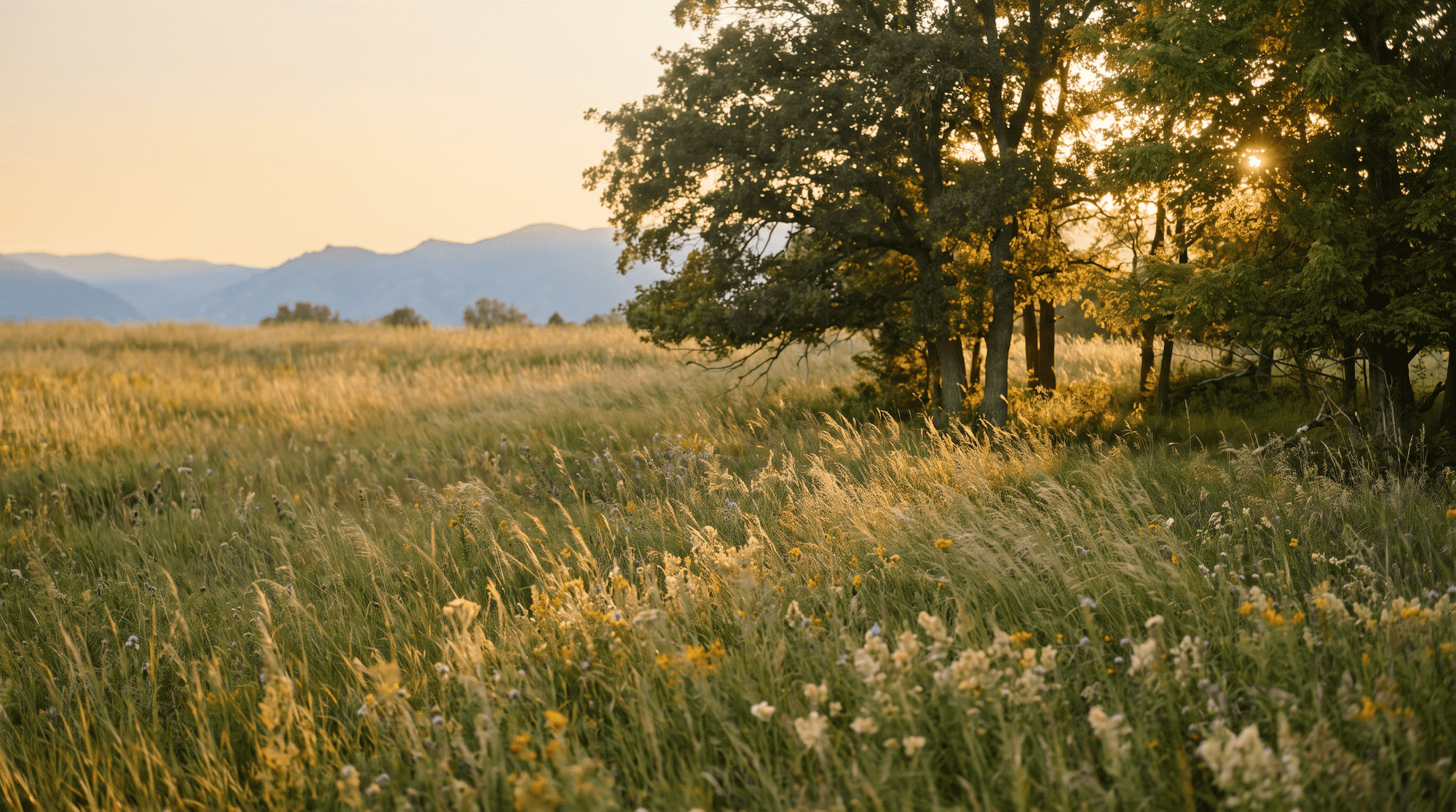

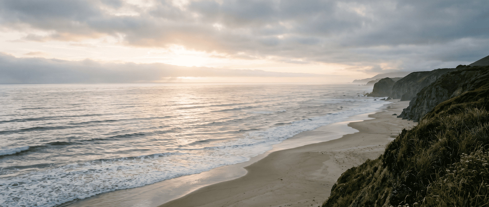
The landing page uses photography to set a mood. Inside the app, imagery does more work than that — it should make a member feel like they’ve stepped inside an actual sanctuary made up of distinct rooms (Studio, Library, Lounge), not just scrolled past a pretty picture. Lean on real, spatial photography that gives each room its own sense of place, more immersive than what these marketing pages need.